SIMnet Assignment Manager
Empowering instructors to manage their assignments independently
SIMnet is a learning platform for teaching Microsoft products to college students. Instructors spend most of their time managing their assignments but rarely do it alone. Beyond basic setup, they heavily rely on customer success specialists, unaware that the features they need already exist, just scattered across disconnected workspaces.
In fall 2025, I led design to consolidate the assignment management experience so that instructors could manage their assignments independently. SIMnet's assignment NPS improved by 6 points and task completion rates increased from 20% to 90%.
Key Stakeholders
Product Owner
Technical Product Manager
Director of Engineering
Senior Front-end Developer
Accessibility Coach
Role
SIMnet Lead UX Designer including accessibility, design systems, and research
Duration
3 months
Highlights
Instructors + Admins
Task completion increased from 20% to 90%.
Business
Reduced customer success specialists volume by 40%.
Organization Wide
Patterns adopted by 15+ designers and 10+ teams.
Empathize
Managing assignments ranked lowest in platform's NPS score
Since the SIMnet team started tracking NPS using Pendo in 2024, assignment management ranked as the lowest performing feature in SIMnet.
36
Overall NPS
33
Gradebook NPS
39
23
Assignment NPS
Pendo survey, assignment NPS scored lowest
When we talked with customer support specialists,
Each shared a similar story when asked about what instructors struggle with the most.
Instructors would reach out saying they can't find or figure out how to perform an instructor task*, and customer success would always respond…
That feature exists, but it's located somewhere else.
An instructor task here includes updating due dates all at once, re-ordering assignments, and scheduling pop quizzes.*
Research
We held interviews, usability tests, and reviewed feedback we've collected over the last year.
7
Instructors interviewed
2 newer instructors (< 2 years)
2 experienced instructors (2-9)
3 legacy instructors (10+)
10
Unmoderated usability tests
50+
Multi-survey responses
Q3 2024 – Q3 2025
Only about 20% of instructors were able to complete organize and edit tasks on their own.
Even when instructors found or were nudged to the right workspace, instructors struggled to understand what actions were available, how to trigger them, and what to expect.
Furthermore, some instructors were finding solutions to tasks like bulk editing by painstakingly editing assignments one at a time, which was even more undesirable.
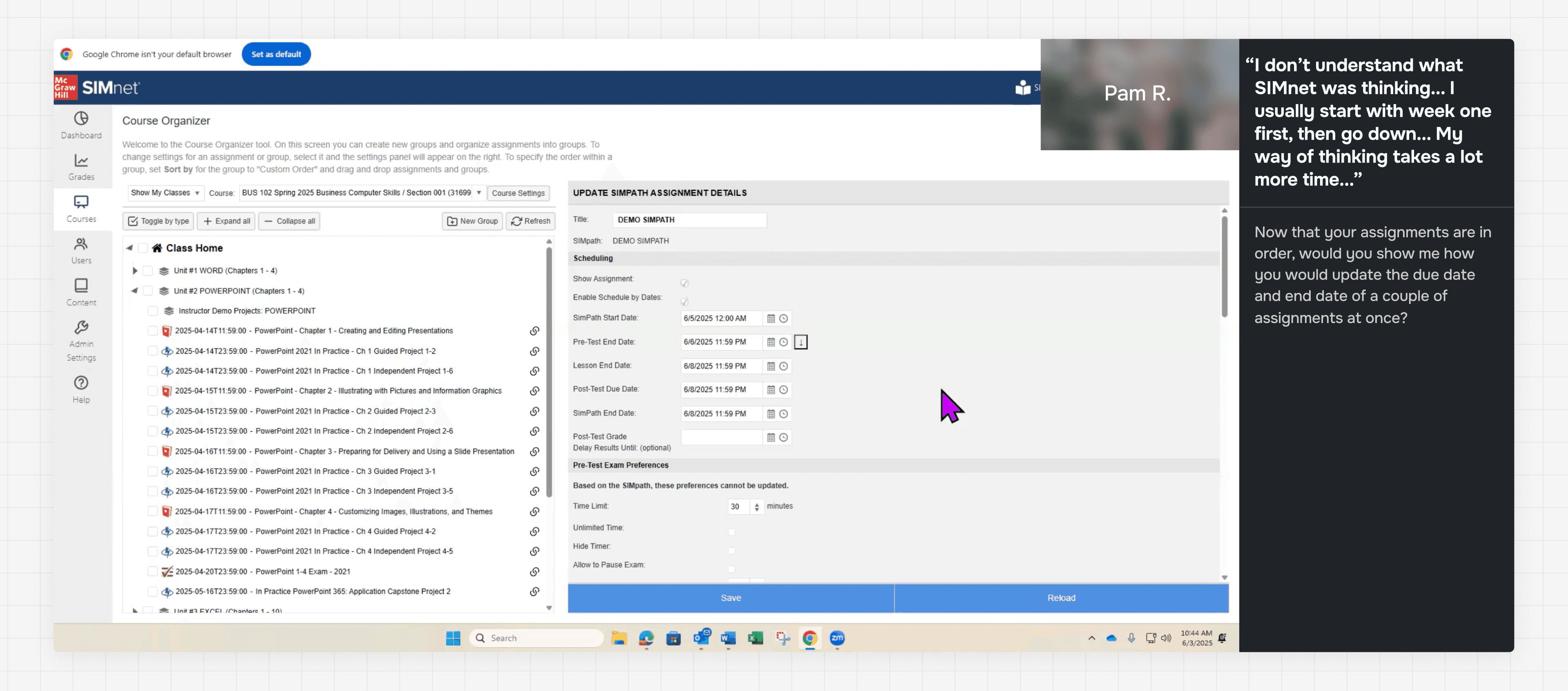
Pam R. showing their work-around to edit assignments dates in bulk
Define
Research revealed two compounding problems
Instructors struggled to discover features, and when they did, the interfaces made tasks nearly impossible to complete independently.
Instructors discover one workspace
Usually organize, or whichever they encounter first.
Learn features available in that workspace
Treat it as the complete experience.
Hit a task their workspace can't do
Unsure where to navigate to or how to accomplish the task.
Call customer support
For features that exist elsewhere.
Navigate to another workspace
Eventually finds where the feature lives.
Can't figure out how to activate it
Core actions are buried and unintuitive.
Call customer support
When stuck with a confusing interface.
Instructors learn one and forget the rest
Instructors have a single-context mental model, but assignment management spans 3 distinct workspaces. Especially for new (<2 years) and legacy instructors (10+), any feature outside their primary workspace is effectively invisible to them.
An instructor in the organize workspace, for example, had no idea they could bulk-edit assignment details in the edit workspace. We needed to consolidate these disconnected spaces into a single, unified experience so that the platform could match instructors' mental models.
Tools from View and Edit workspaces are effectively invisible
Core actions are hard to find and even harder to use
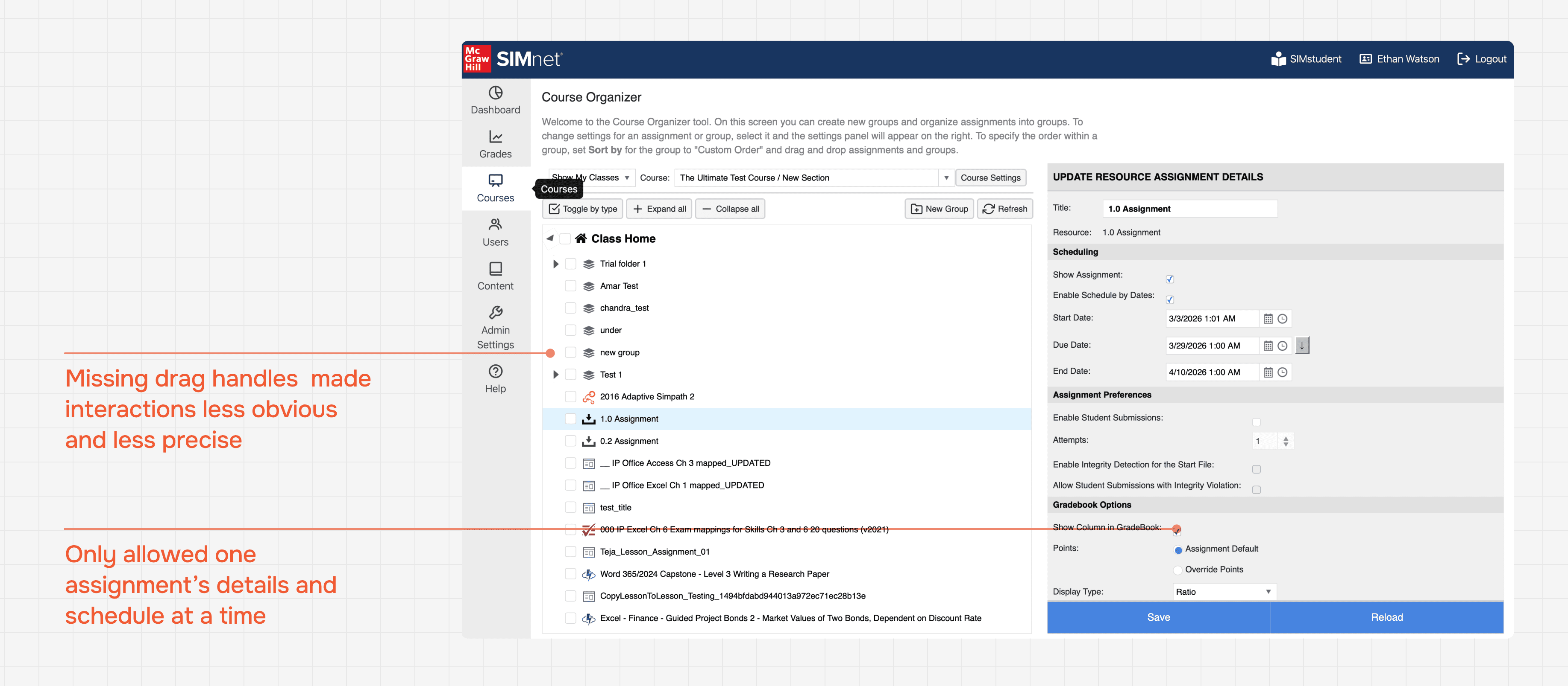
Even within the workspaces, these actions are hidden behind complex drag clicks, or weren’t registering with instructors.
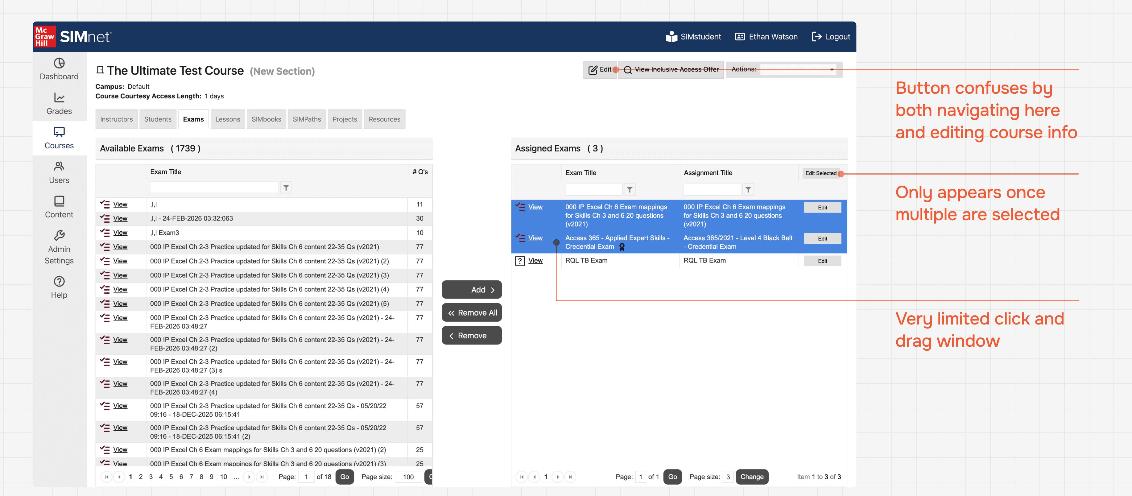
Instructors stumped when trying to bulk-edit
Bulk-editing was hidden behind a complex drag click selection within a two grid page.
Organizing was just as challenging to activate
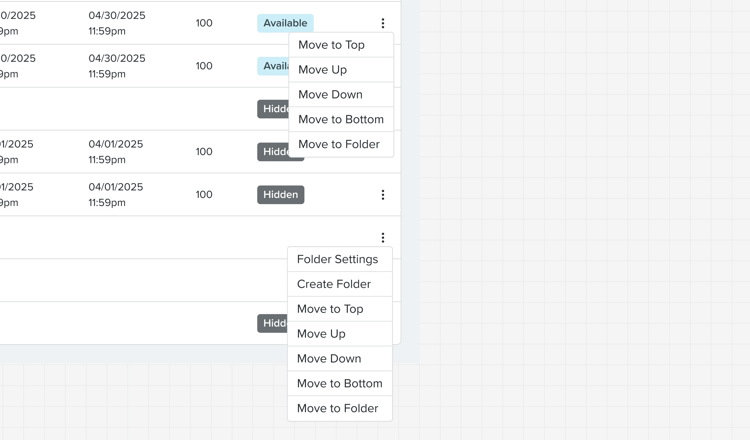
Tasks like bulk-editing and organizing assignments proved hardest to complete on their own, whether that was navigating to the right workspace or knowing how to activate the feature once there.
How might we help instructors discover and use assignment management features on their own?
Consolidate
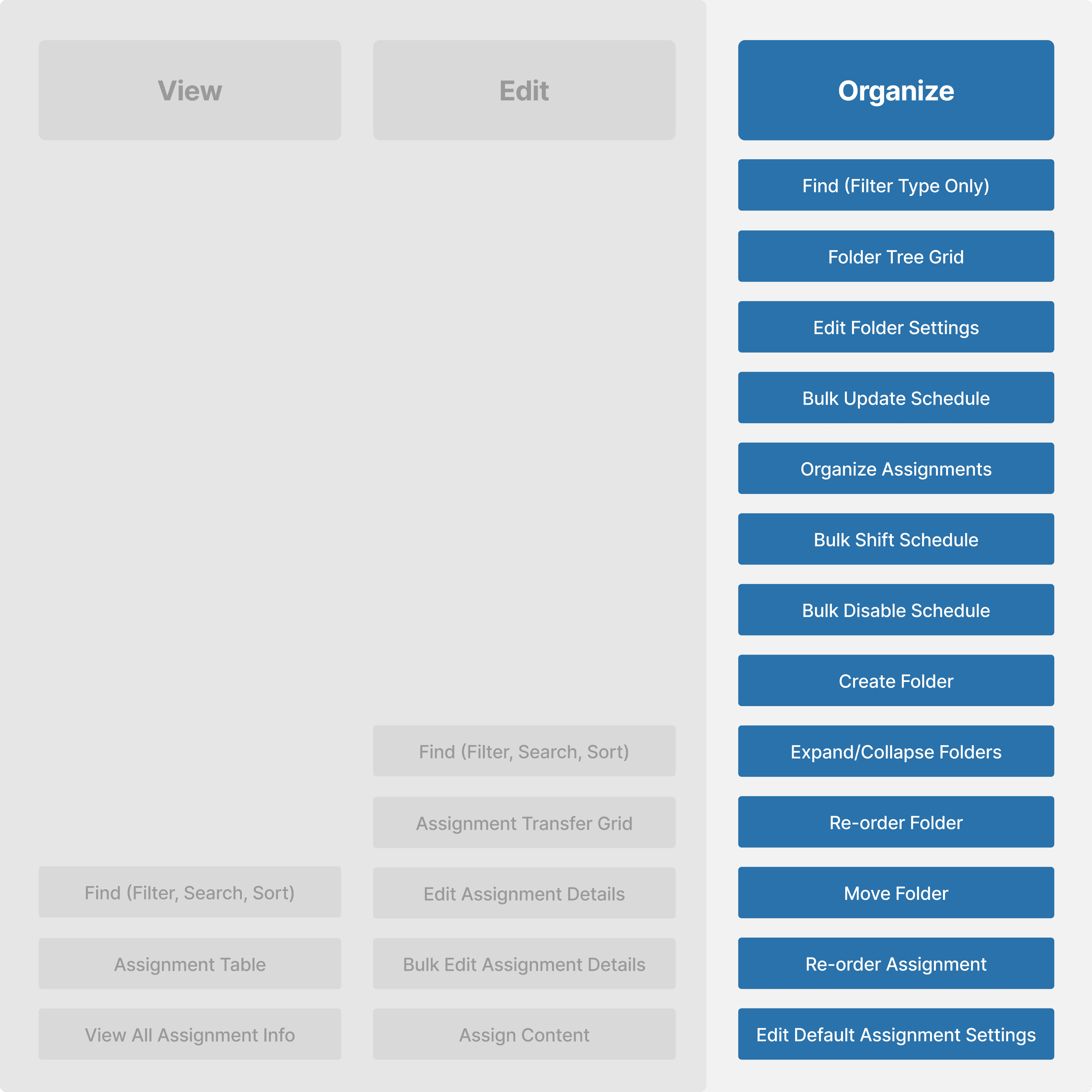
We took stock of our must-have features including organizing nested folders, bulk actions, and the data on-screen.
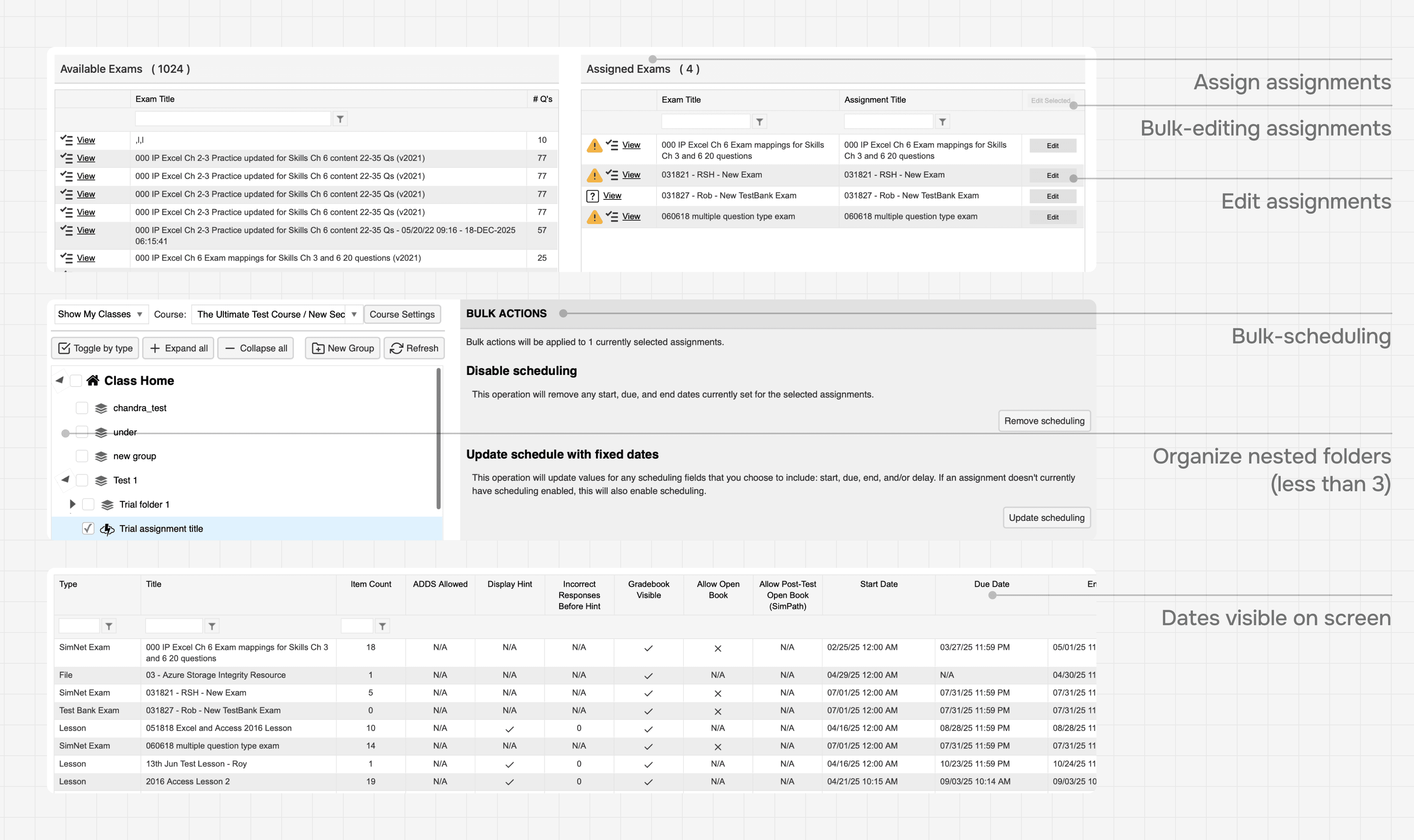
Our must-have constraints
Validating with competitive analysis
Leading learning management systems (Canvas, ALEKS) and organizational tools (Jira, Google Drive) keep complex actions like multiselect and drag and drop in a single, consistent workspace. We took that as our starting point.
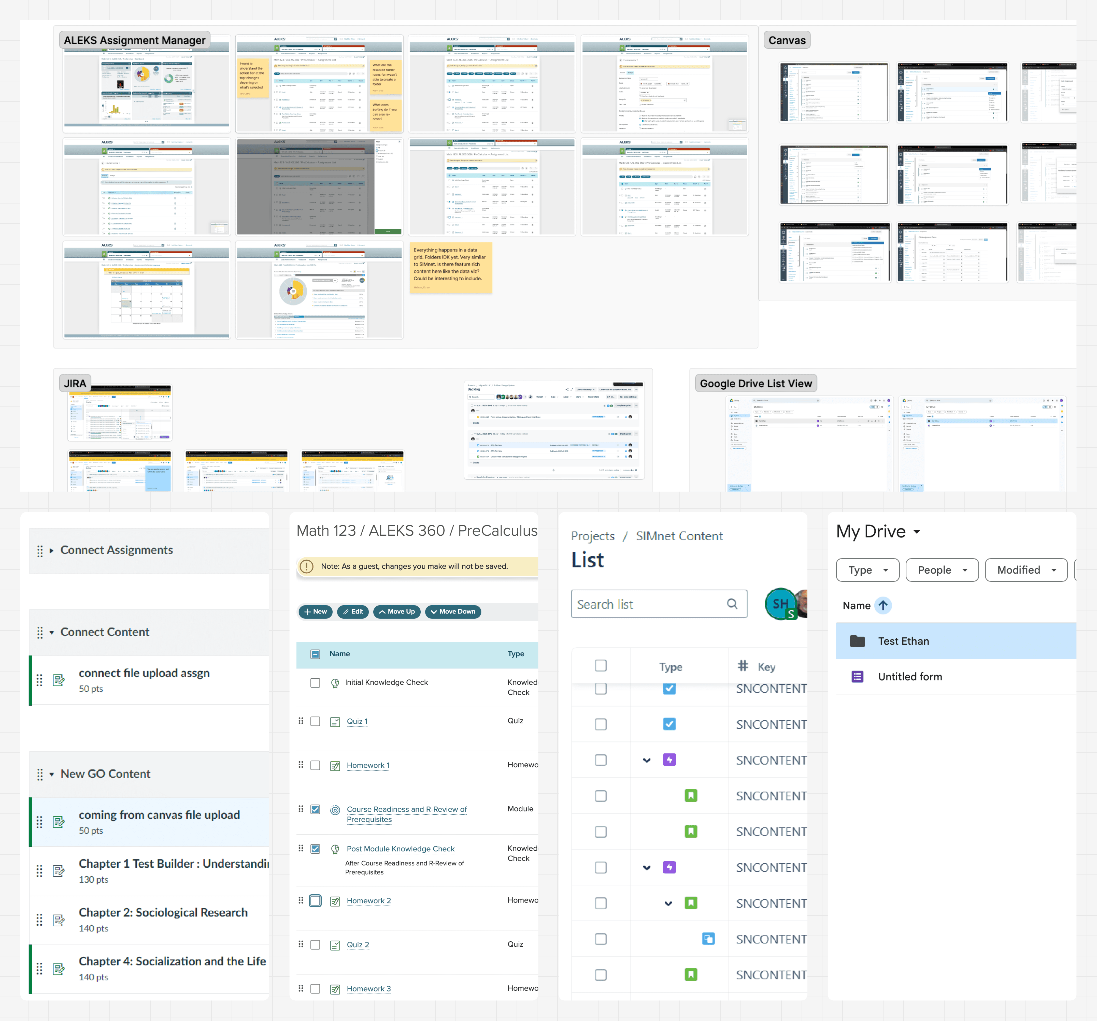
Canvas, ALEKS, Jira, and Google Drive
Design
Starting with easy discovery
Our first concept was a unified workspace: a single tree grid where instructors could view, edit, and organize all assignments in one place.
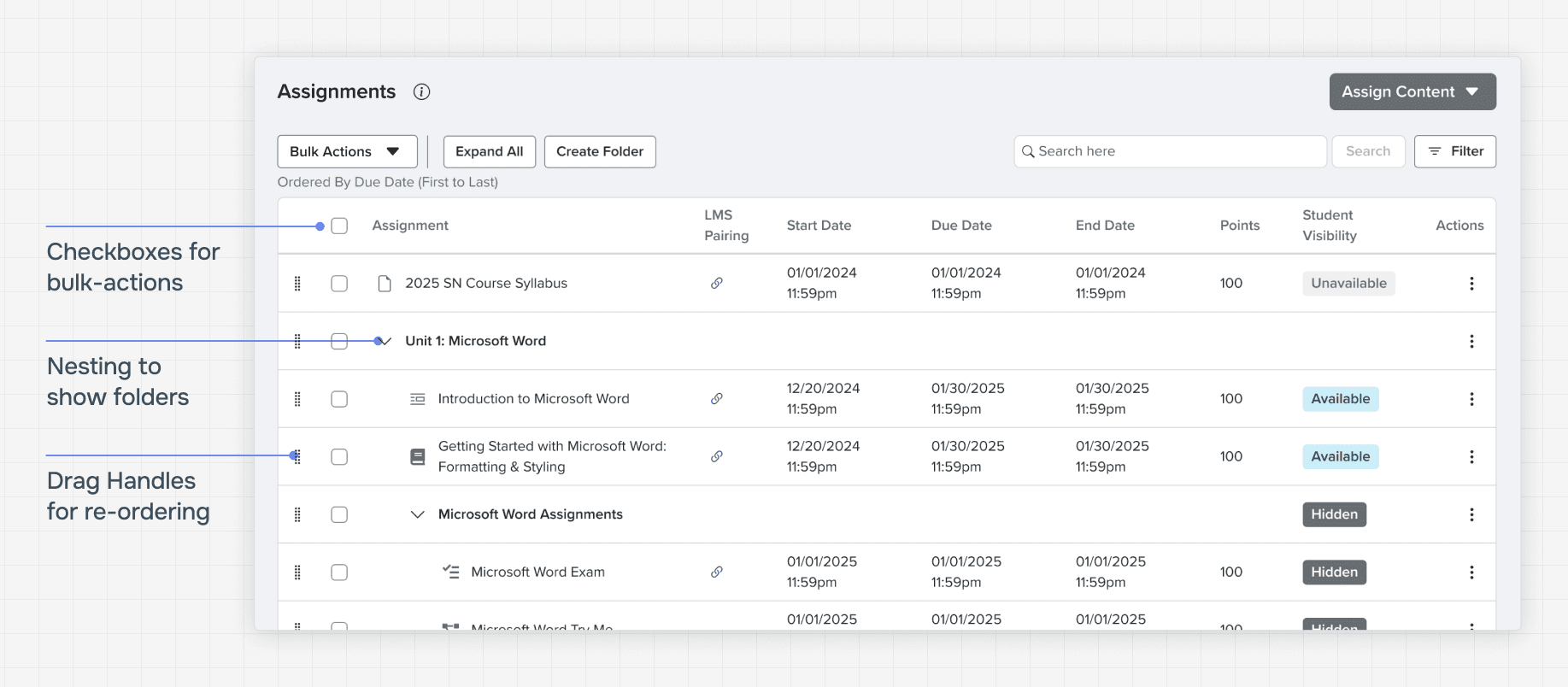
View, edit, and organize in one workspace
Accessibility team vs. product requirements
Our accessibility team and product owner couldn't agree on a single solution, and references like the ARIA APG and ag-grid each had gaps that made them insufficient on their own.
This was an org-wide issue to the point where teams were cutting features from roadmaps, removing dragging interactions entirely, or only re-ordering with one-click solutions.
Single-click re-ordering. Did not meet user expectations at ALL!
To break the deadlock,
I dove into WCAG 2.2 AA criteria alongside our product requirements, learning both sides well enough to find where they could meet. I then annotated every element and interaction with the specific ARIA roles, WCAG criteria, and keyboard behavior. That gave the accessibility team the confidence to trust that each product decision was designed accessibly.
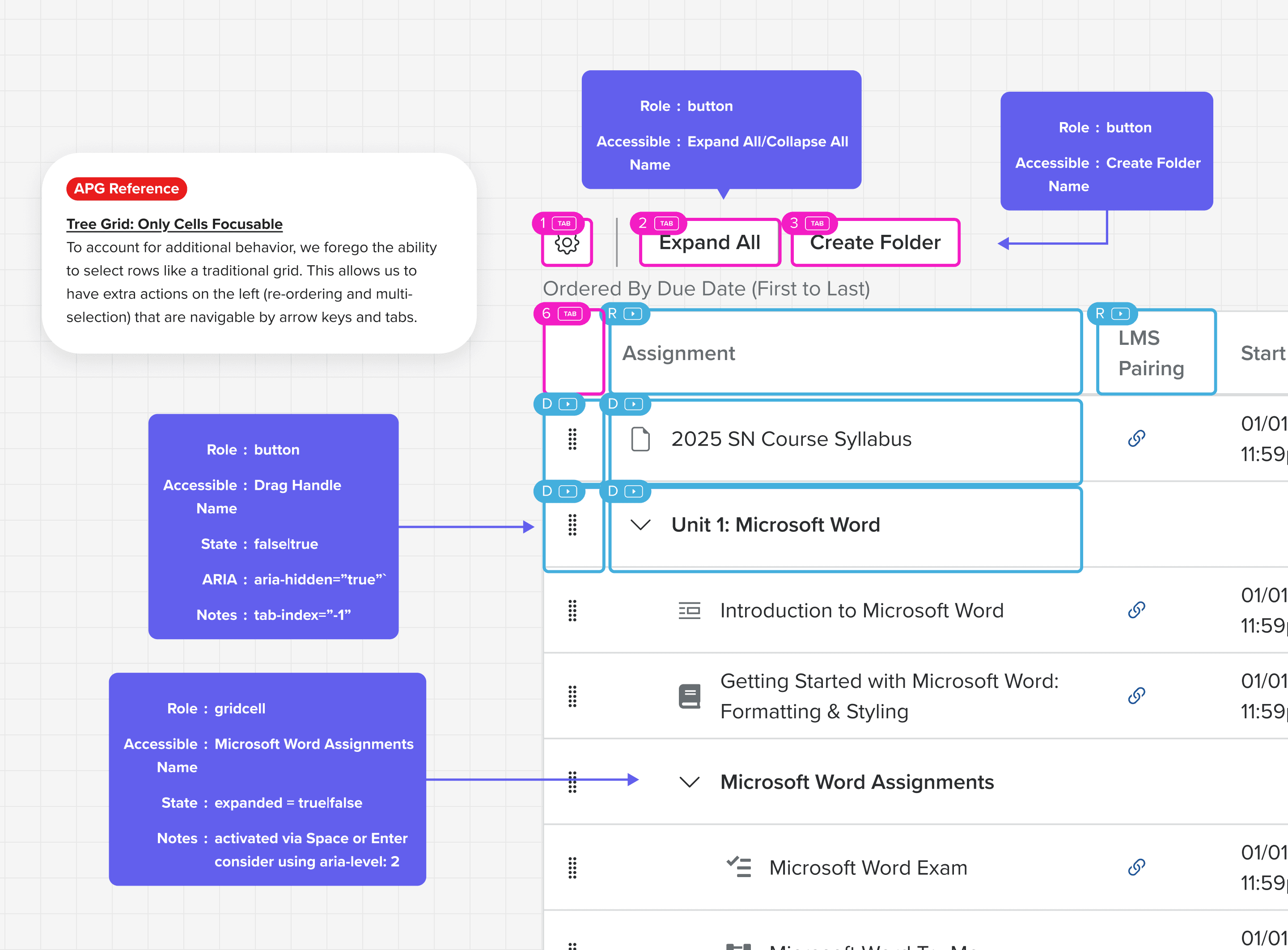
A11y annotations and references for organize
Refining organizing
Working closely with developers and the a11y coach, we defined edges cases for all possible scenarios.

Edge cases for re-ordering folders and assignments

Behavior specs for drag-and-drop
When we started testing the new concept, three things stood out.
Reduced cognitive load
Instructors agreed the unified layout was easier to understand and use.
Navigation solved
100% of instructors successfully found where to manage assignments.
New and legacy instructors struggled with having both bulk editing and organizing tasks available at one time.
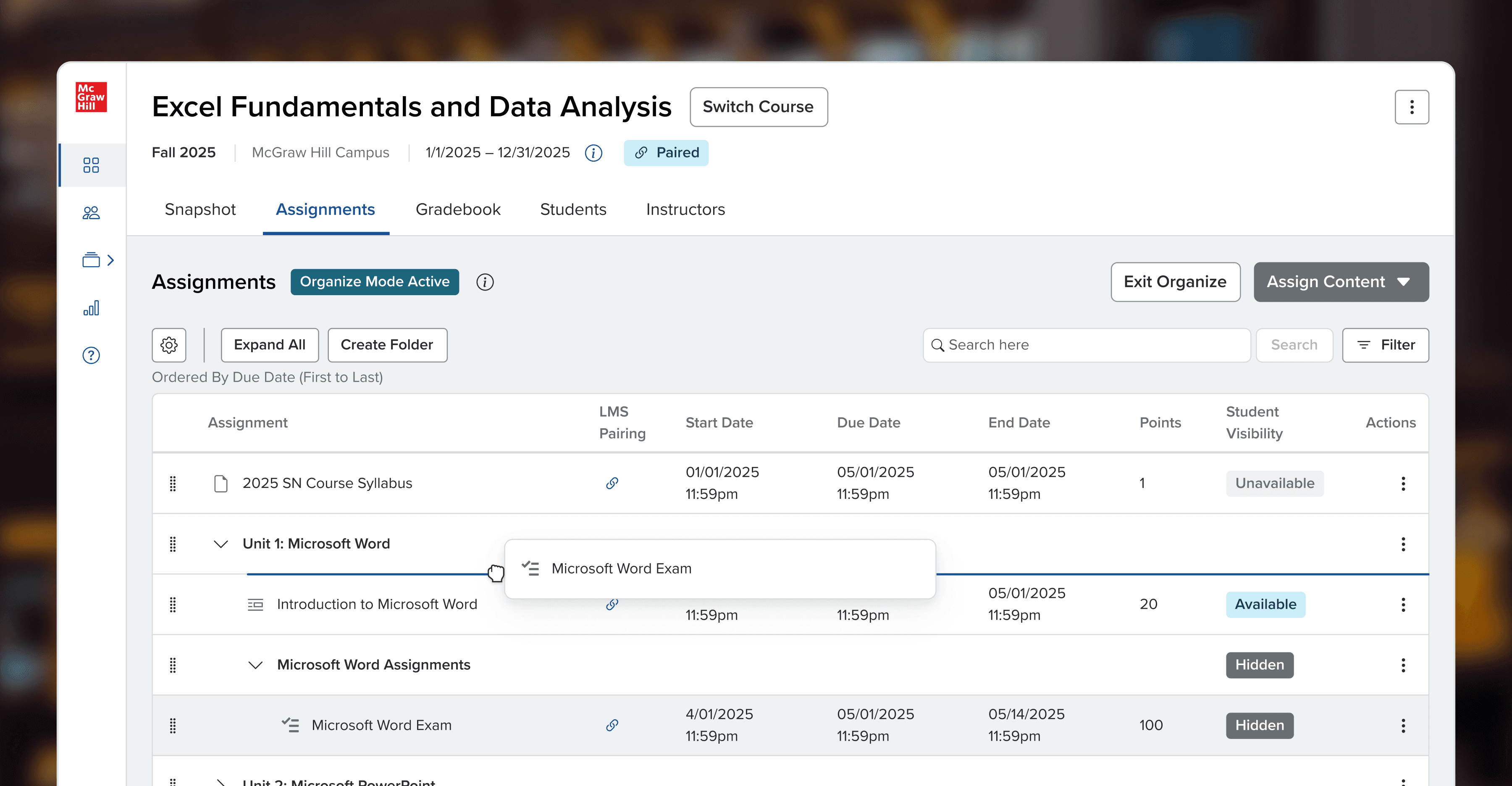
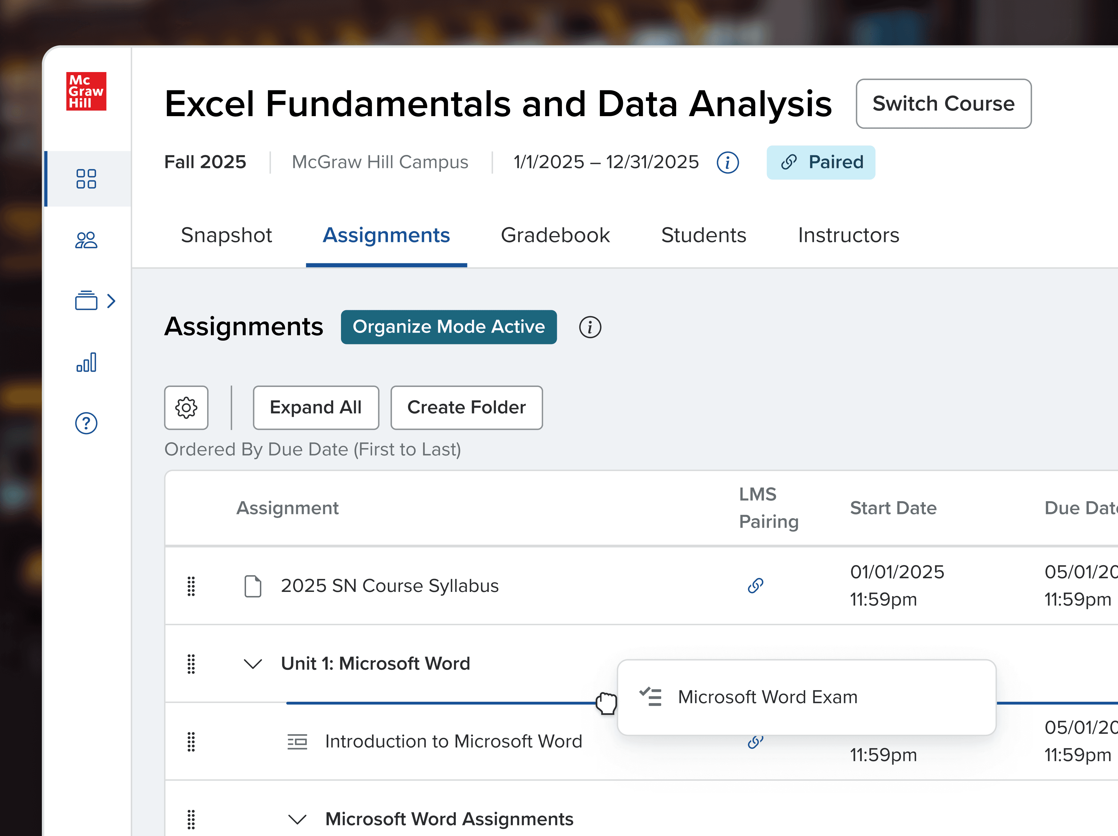
Having both checkboxes and drag handles visible at once was more than instructors could handle. We pivoted to a dedicated organize mode, keeping the main workspace cleaner. Inside organize mode, an identical layout with drag handles instead of checkboxes made the transition feel familiar rather than like learning something new.
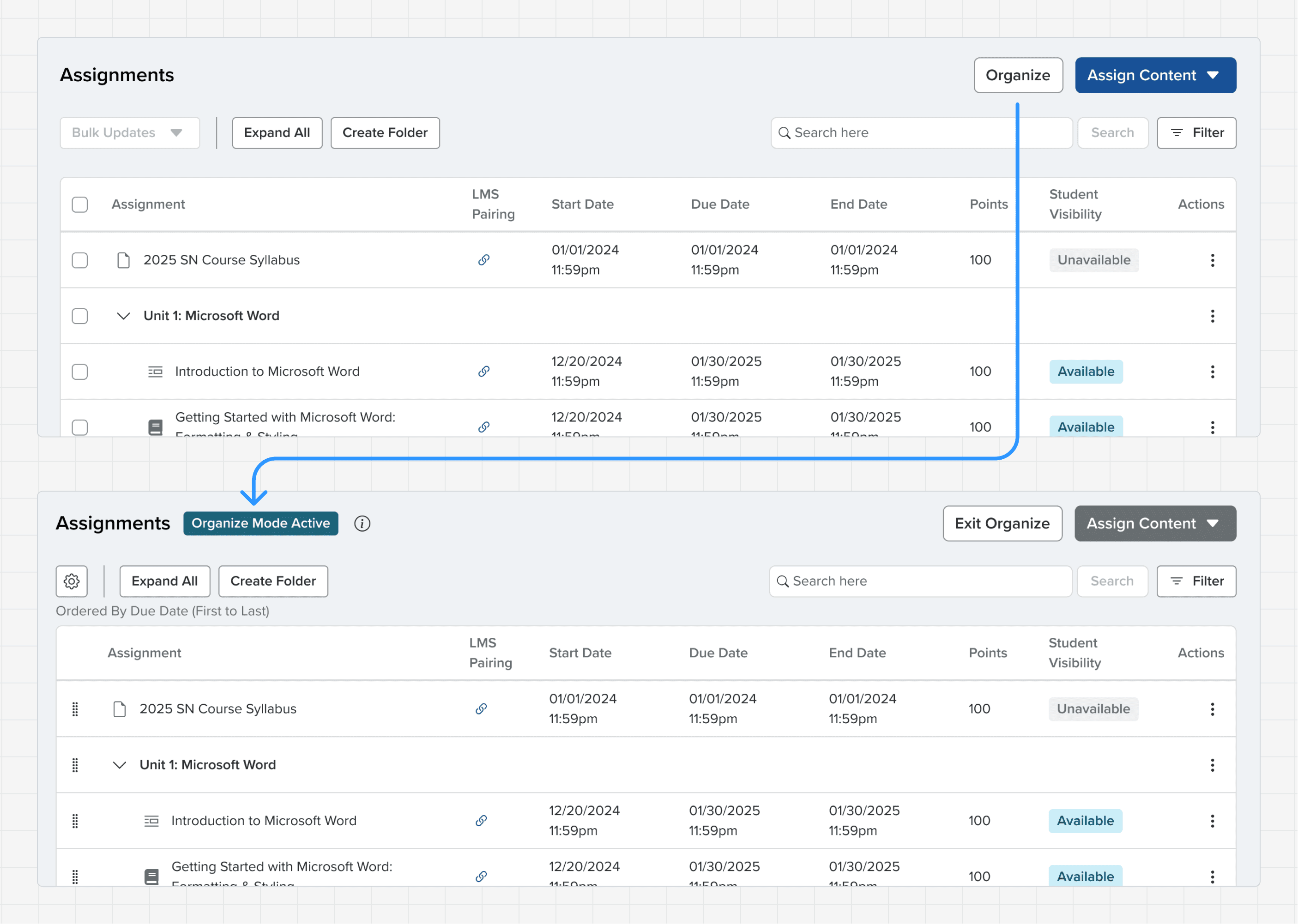
The issue wasn't separated features, but different layouts and discovery
Two modes kept workflows separate while still consolidating three workspaces.

Separate yet closely connected and related
Impact
Markedly improved experience
Discoverability improved, support dependency reduced
Task completion rates jumped from 20% to 90% in usability testing. The majority of Instructors could complete complex workflows like bulk-scheduling and organizing without support.
Satisfaction improved significantly
Assignment management NPS increased 6 points from 23 to 29, and in final testing, all 10 instructors preferred the redesigned experience.
What instructors said
"We all used the course organizer to move and update lessons—very intuitive."
"First, I really liked the look of it and the ease of making assignments. Changing dates in a group was so much easier."
"Scheduling assignments and adjusting scheduling options like due dates was easy and seamless."
Reflection
Lean on your product partners, and learn your product
I was convinced that for assignment organizing, instructors would want everything in one workspace, like modern productivity tools. However, a few stakeholders suspected it would be overwhelming for instructors, and rapid validation prototype testing validated their concerns.
Although not the "ideal" solution, it was the right one for our product and the people using it. Working through it built real trust across the team that carried into future projects.
"Course Organizer, Assignments & Extensions, and the Gradebook all rank high among our team testing the new interface. There are many improvements that save time and make processes more intuitive."
"Bulk Updates are great!" / "Yes. Bulk updates are huge."
"Organize is nice because it's already there. I can — it's easy to see things. It's easy to see."
"I love the blue light bulb dropdown. That really helped make it easy for me to understand how to be able to drag and make changes in terms of the order that I want the assignments."
"I created folders for each chapter and assignments—smooth and efficient."
"The new interface feels ready for real classroom use"
"This was a breath of refreshing air! This platform... has finally been updated to feel like a modern, fluid, responsive tool for learning."